Hello Truck Mechanics!
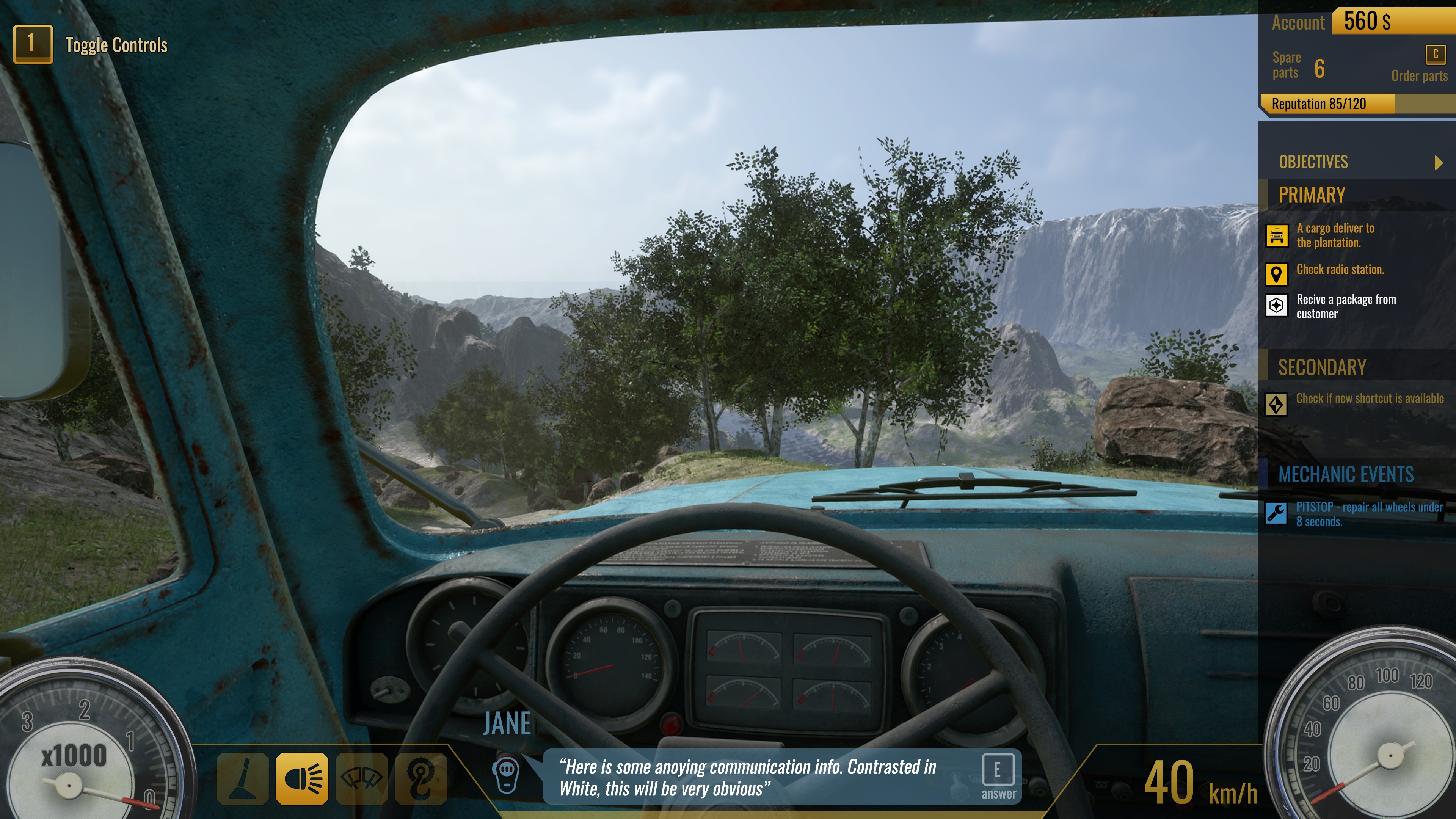
Welcome to more developer diaries dedicated to Truck Mechanic: Dangerous Paths. Today we want to touch on the important topic of UI for you. We are considering which direction to go. Is it more minimalist, or on the foundations of the old one to update its appearance.
More or Less?
Which option is more accessible to you? An expansion of what you might have seen in the prologue – served up in a better way? Our idea is quite simple, for example, the mission objectives will be activated by a button so that when we want to completely sink into the game they don’t take up unnecessary space on the screen. You will be able to activate them at any time, so that the panel will appear and disappear as you see fit. Or something more minimalistic based on simple, easy to read icons?

Our choice
Both options have their pros and cons. For the moment, we’re betting on improving what you saw in the prologue. Improving by the ability to hide those complex panels, and making it more friendly to the players. It must be simple, readable and understandable. Convey specific information that will be needed during the tasks. On this occasion, we would like to know your opinions. Maybe you have some interesting suggestions? We would love to hear them!
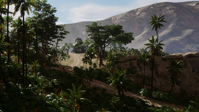
We encourage you to actively comment and share your ideas with us. Remember that all the screenshots shown above are from a WIP build, they don’t reflect the final version of the game.
Thank you
Atomic Jelly